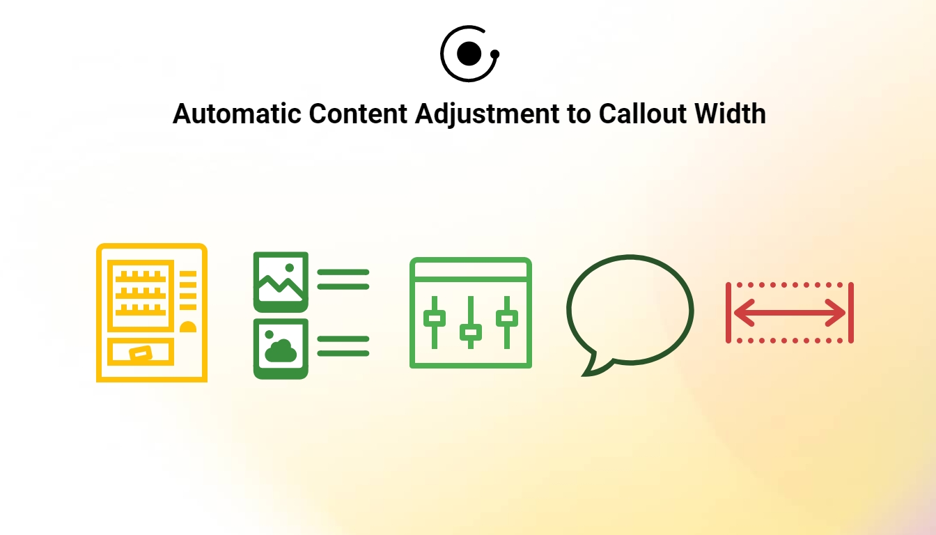
Smarter Callouts, Better UX with Auto-Adjusted Callout Width
GRAVITY now auto-adjusts content width to fit Callouts—no more gaps, scrollbars, or layout issues. Smarter visuals, smoother onboarding.
There’s a fine line between clean design and clunky layout—and it often comes down to the little things. In GRAVITY, we spend a lot of time thinking about how to make guidance feel seamless, smart, and supportive. One of those subtle but meaningful changes? Callouts in GRAVITY now come with smarter layout behavior: the width of the content inside is automatically adjusted to fit the size of the Callout.
That’s right—whether you’re working with text or images, GRAVITY ensures that your content scales neatly to match the Callout’s dimensions. The result? No more awkward gaps or misaligned visuals—just clean, consistent guidance that looks great across all screen sizes.
Why This Matters
Callouts are a key element in many GRAVITY guides. They help you highlight important information, give users the context they need, and structure complex workflows into easy-to-digest steps. But if the Callout width doesn’t align with the content it holds, things can quickly start to feel off.
With this update, GRAVITY Callouts are now smart enough to:
- Match their width to the content inside them, making the layout feel tighter and more natural.
- Avoid empty horizontal space, especially in shorter messages or when using visuals.
- Respect a maximum width, so the Callout never grows too large or disrupts your page layout.
No more empty margins or oversized boxes for single-sentence tips—your Callouts will now size themselves beautifully, every time.
A Note on Visual Content
Images are a powerful way to communicate, and Callouts are often used to give them the spotlight they deserve. With the new auto-sizing logic, GRAVITY ensures that images and Callouts play nicely together.
Here’s how:
Images via URL Link
When you embed an image using a direct URL, the image automatically adjusts to fit the width of the Callout. That means the image will scale proportionally—wider Callout, bigger image; narrower Callout, smaller image—without distortion.

Uploaded Images via GRAVITY
When you upload an image through GRAVITY, it appears in a lightbox with a maximum display size of 800x600 pixels. If your image exceeds these dimensions, GRAVITY will automatically resize it, so users always get a clean and consistent view.
Combined with the Callout width behavior, this makes for a much more polished visual experience—especially in knowledge base articles or guided tours.

Embrace the digital adoption platform of tomorrow - GRAVITY
The Digital Adoption Updates You Can't Miss - Subscribe Now!
Join Our Monthly Author Call – Stay Ahead of the Curve with the Latest Trends!
Dealing with Scrollbars? Here's a Quick Fix
Sometimes, when adding images or longer pieces of text to a Callout, you might notice a vertical scrollbar appear. This happens when the content height exceeds the default Callout height. While this isn’t necessarily a bad thing, you might prefer your Callout to expand fully—especially for displaying large images or longer text without cutting anything off.
Instead of resorting to trial and error to guess the right size, here’s a quick and simple way to get it just right:
- Go into Edit Mode.
- Navigate to Step 2
- Scroll down to the Callout Size section
- Adjust the Max Callout Content Height field (we recommend trying 1000 as a starting point)

This ensures that your Callout automatically resizes vertically to display all the content, without scrollbars—clean, simple, and frustration-free.
A Small Change That Makes a Big Impact
At GRAVITY, we believe great user experiences are built on the little details. That’s why improvements like this matter—because they remove friction not just for your users, but for you as a content creator.
The new auto-adjusted Callout width feature is now live, and it’s already making GRAVITY content feel smarter, sharper, and more responsive than ever.

Ramona Lescesen
After completing my Masters in the UK, I had the opportunity to start my career in London's vibrant start-up scene. In my career, I have had the privilege of seeing how a start-up can grow into a global market leader. This has taught me the importance of good communication and how best to manage a company's most important relationships - its customers.
Latest articles
Browse all posts